They had a brand. It just didn’t fit where they were going.
Publisher Collective is a games-focused advertising and technology company. The brand they had was corporate, flat and out of step with the industry and audience they worked within every day. They knew it needed to change. They just needed someone to show them what that looked like.
The situation
The existing identity leaned heavily on a single primary blue and a visual style that belonged in a financial services brochure, not the games industry. It didn’t reflect the energy, the culture or the expectations of the space they operated in. There was no flexibility, no system and nothing that could scale as the company grew.




What I did
I was the sole creative on this. No team, no second opinion. Just me working directly with the head of marketing to redefine the whole thing.
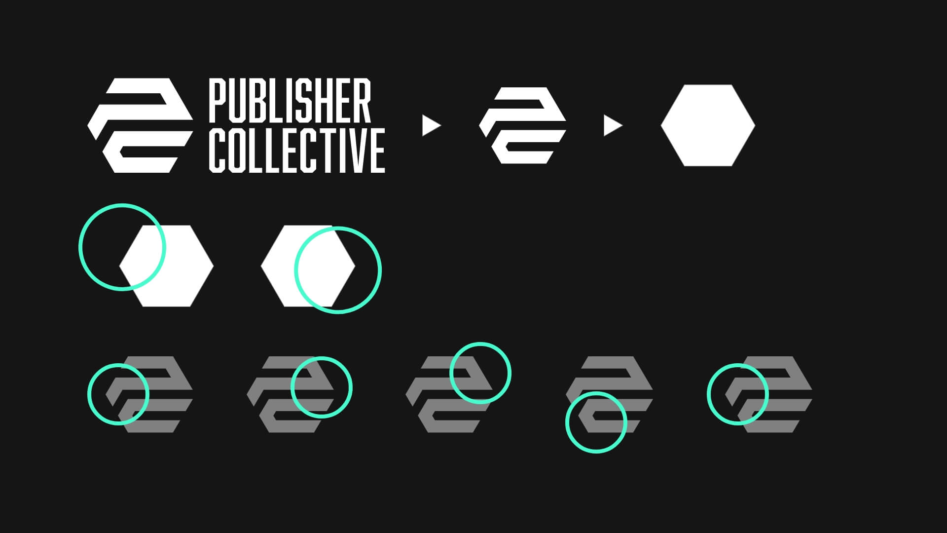
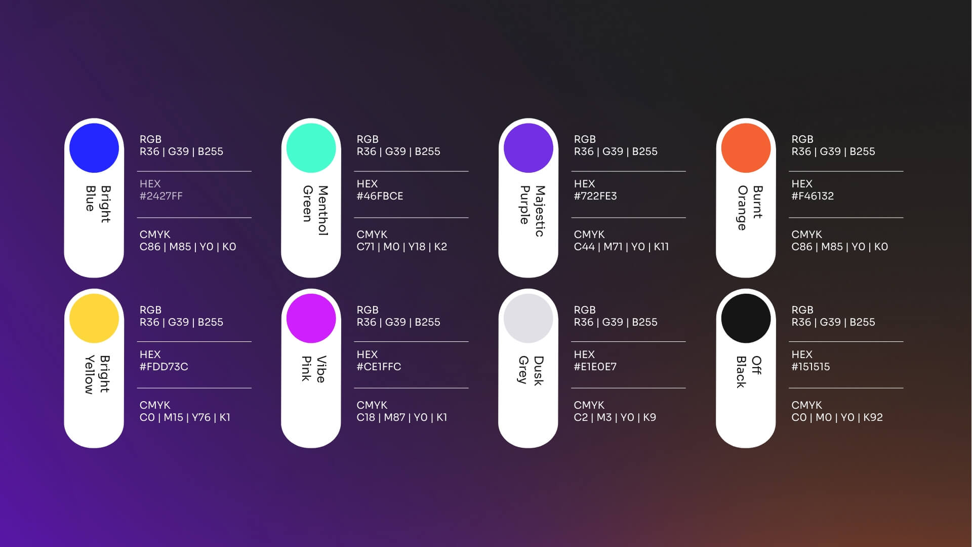
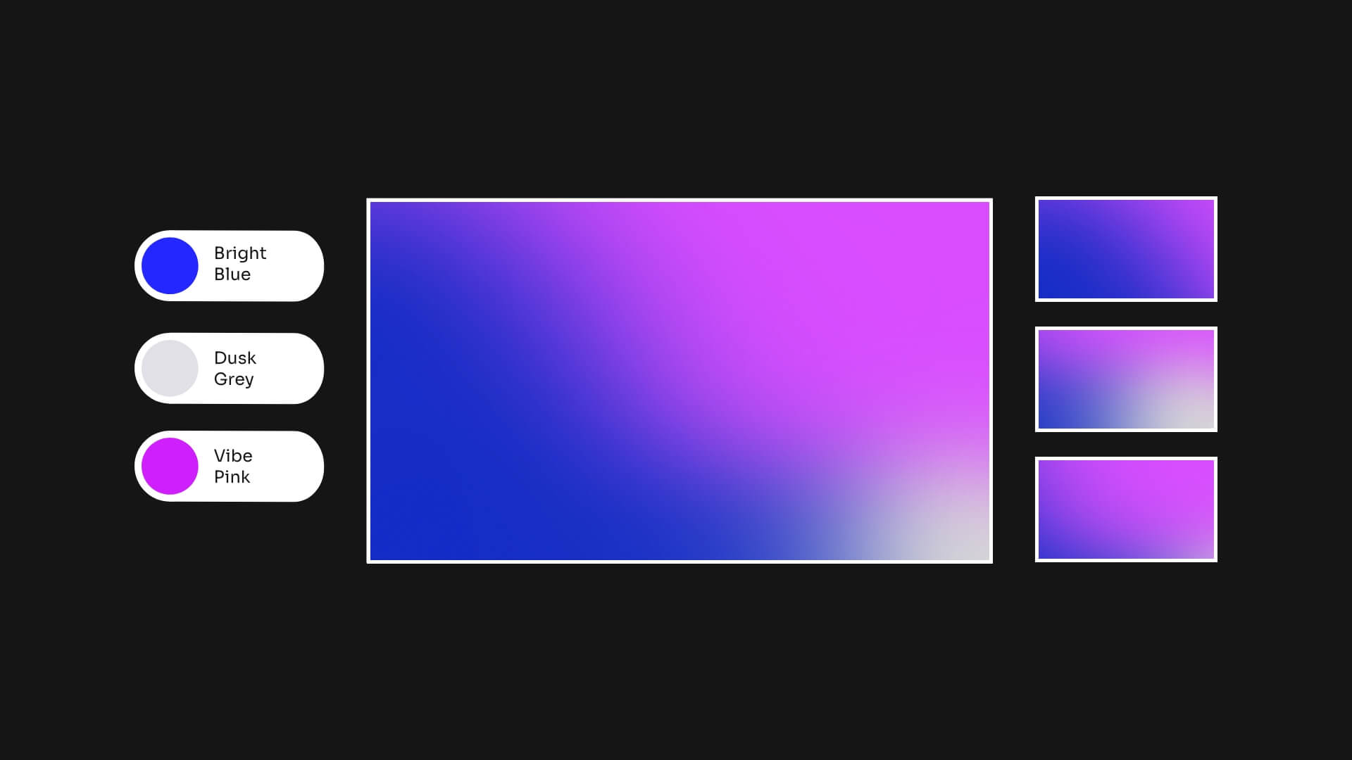
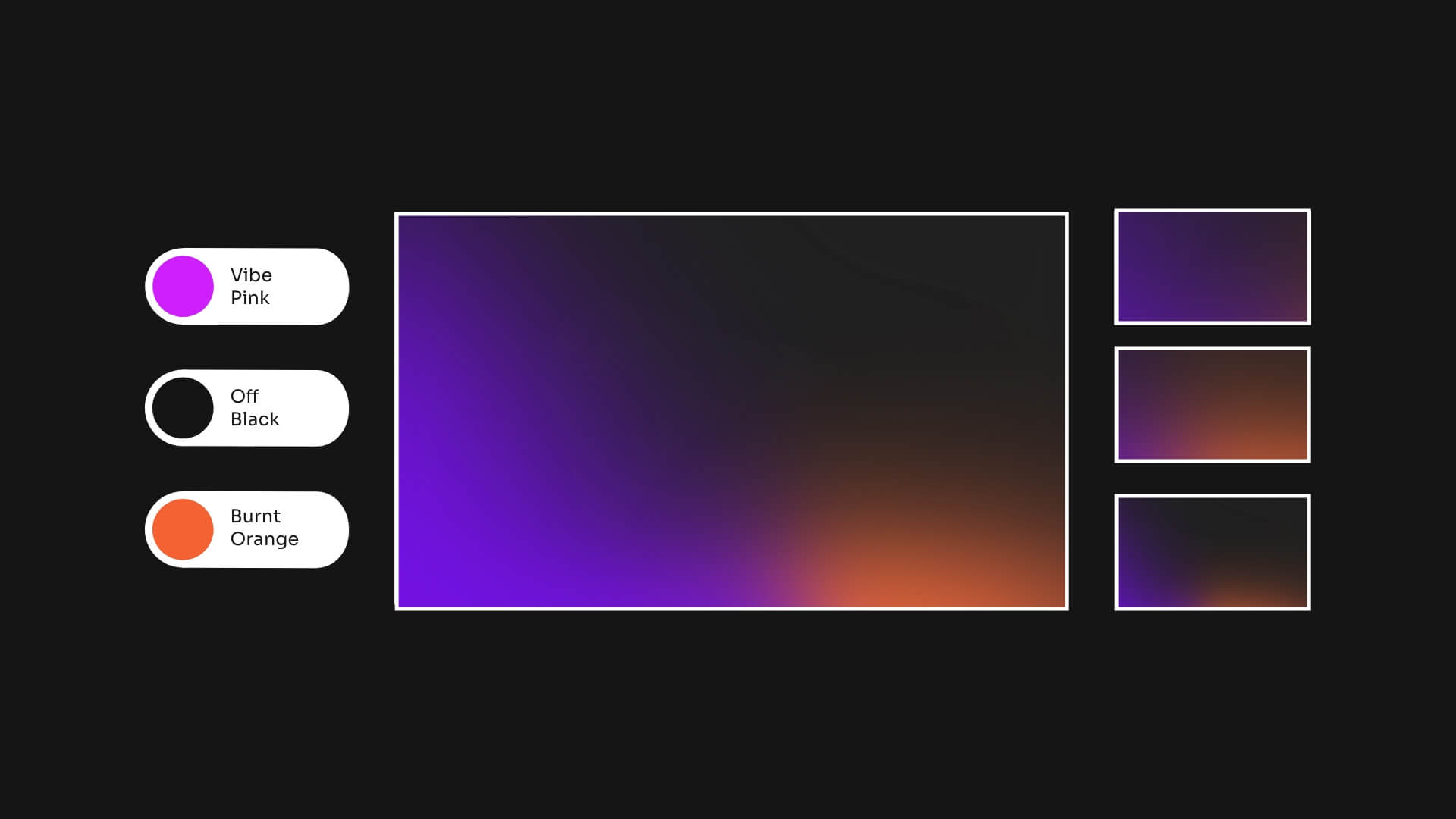
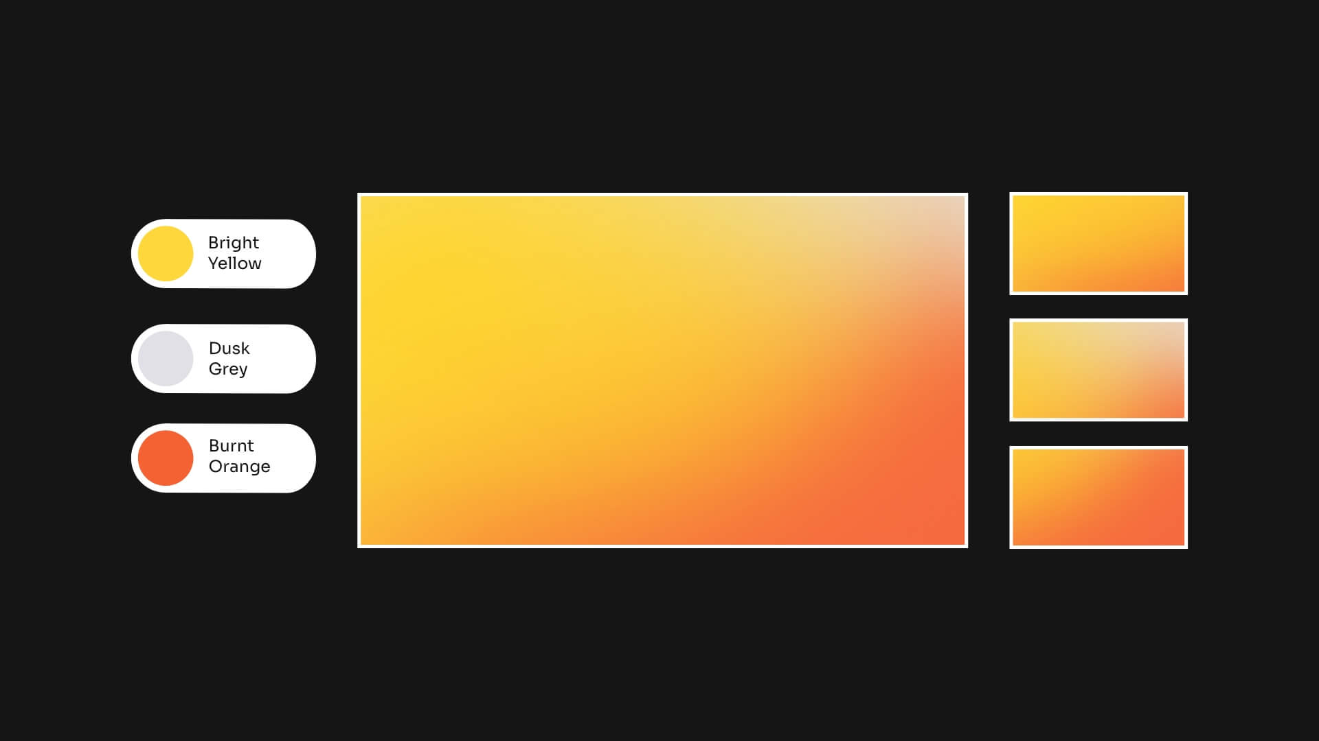
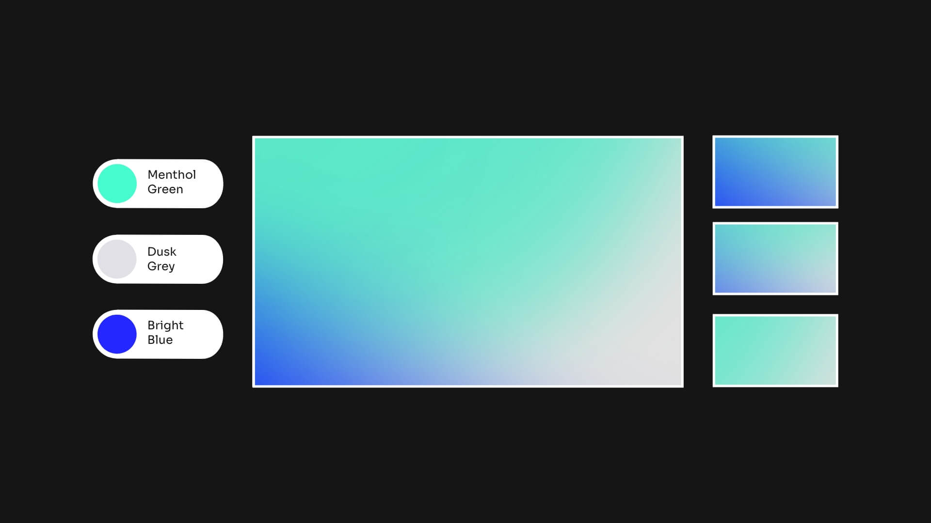
I kept the logo, it had recognition worth preserving, but rebuilt everything around it. The single blue became a multi-colour gradient system: vibrant, techy, flexible. I named each colour palette to give the team shared internal language and make the brand easier to apply consistently. I used geometric forms from the existing logo as modular framing devices, giving the identity a thread that connected everything back to the original mark. I also established a new photography direction and a full set of brand guidelines for rollout.
I presented one direction. They went for it.
The initial brand work led to a long rollout across multiple tranches: presentations, social content, marketing assets, digital communications. I scoped and planned the website redesign before I left, though the build happened after.
What came out of it
The company has since been sold. New owners, new direction, new priorities. And yet the brand I created is still there. They didn’t refresh it, they built on it. The website that followed, scoped after I left and built under entirely new ownership, is still running the same visual system.
There’s no metric for that. But when a brand survives a change of hands and becomes the foundation for everything that comes after it, that tells you it was built right.