I was lucky enough to work with Publisher Collective on refreshing their branding. They have a strong logo already and so were very keen to keep this intact and in place, however, the colour palette, typography and overall design language were in need of a new lease of life.
The client expressed frustration with having the same colours throughout their online presence and decks, so I opted for a different approach of having a range of brand colours that can be used equally, also taking these colours and making them into vibrant gradients. Within each of those gradient colour palettes, I was able to create multiple subgradients to be used.
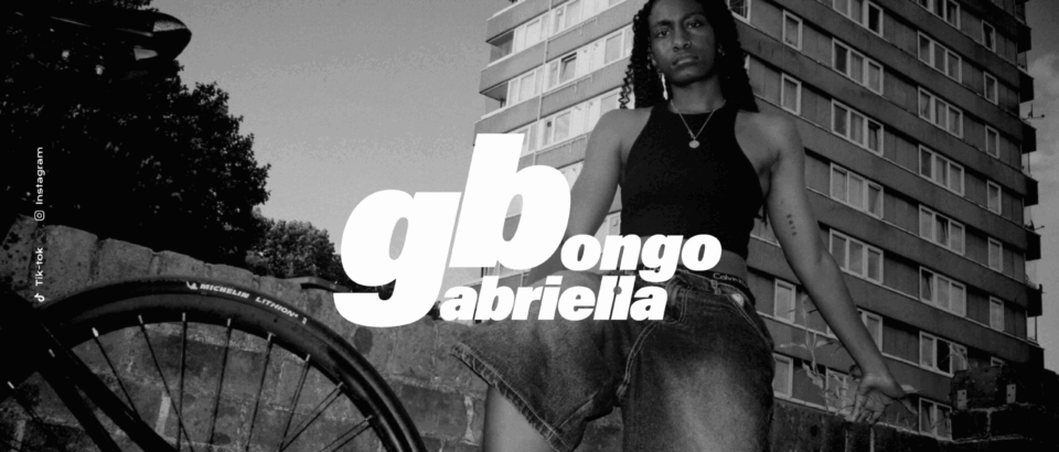
Partnering these new vibrant colours with an angular font and by dissecting parts of the ‘bug’ from the existing logo, I created ‘bug cut out’ images that contrast well with the colours, bringing exciting imagery to text-heavy decks and reinforcing the brand shapes


")