
Ofqual. Nobody said government had to be boring.
Ofqual regulates qualifications, exams and assessments in England. It’s not the most glamorous brief. Regulation, exams, government. The kind of subject matter that usually produces exactly the kind of creative output you’d expect: safe, corporate, forgettable.
That’s what I wanted to change.
The situation
Ofqual had plenty to say. The challenge was saying it in a way that actually landed. There was no content strategy, no video approach, no clear sense of what Ofqual’s voice could sound like outside of official communications. The audience, mostly teachers and education professionals, weren’t really being spoken to in a way that felt relevant to them.
That felt like an opportunity.



How I worked
I wasn’t directing this from a distance. I was hands-on across the whole thing: designing, filming, editing, building templates, producing the podcast. The strategic thinking and the craft were the same job, not separate ones.
Along the way I grew the creative team and reshaped how the roles within it worked.
What I did
The first thing I changed wasn’t the brand. It was the question.
Ofqual’s communications had been built around content production. What do we need to publish this week? I shifted that to something more useful: who are we trying to reach, what do they actually need, and what’s the most effective way to get there?
That thinking shaped everything else.
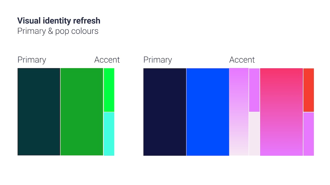
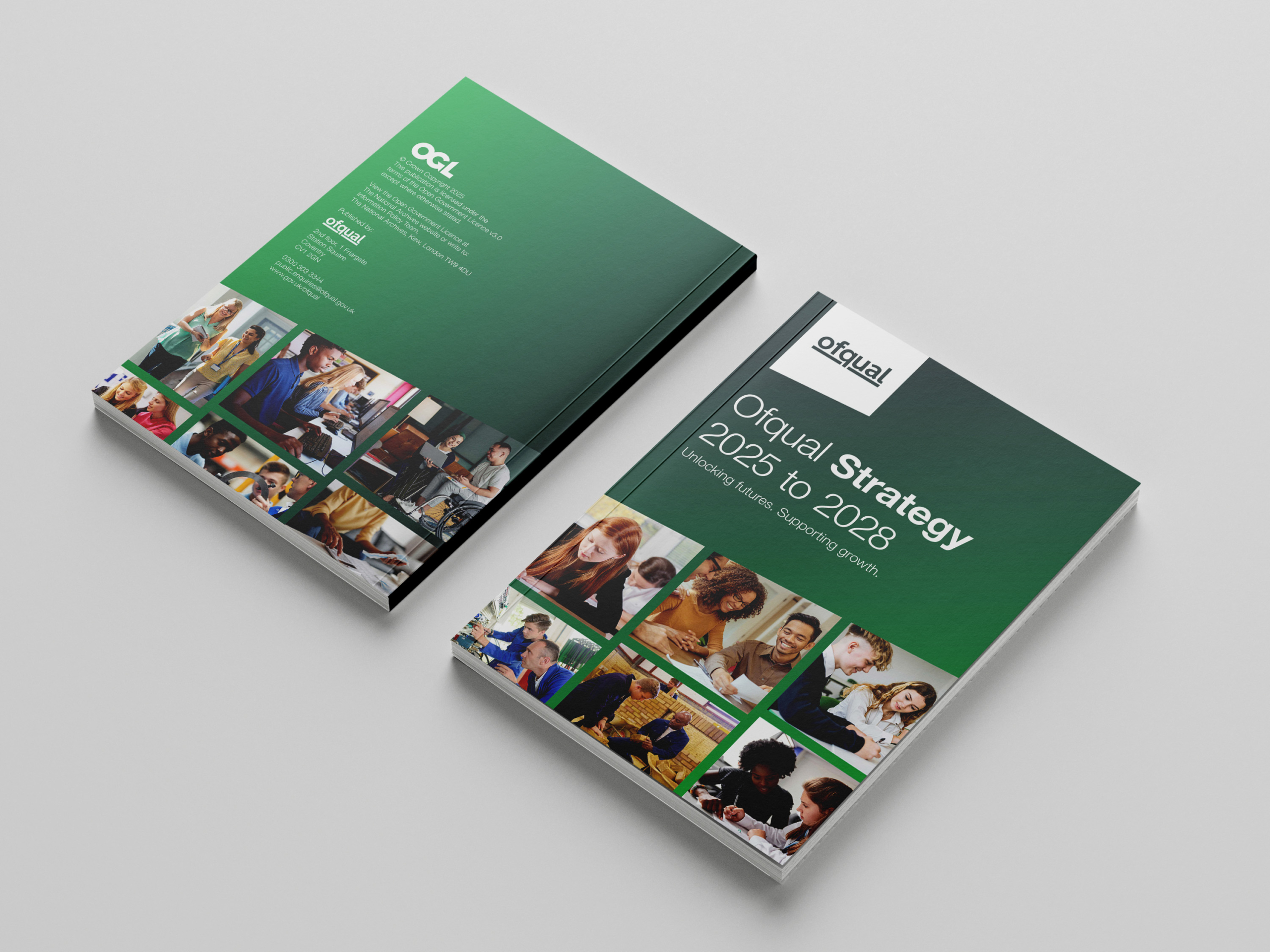
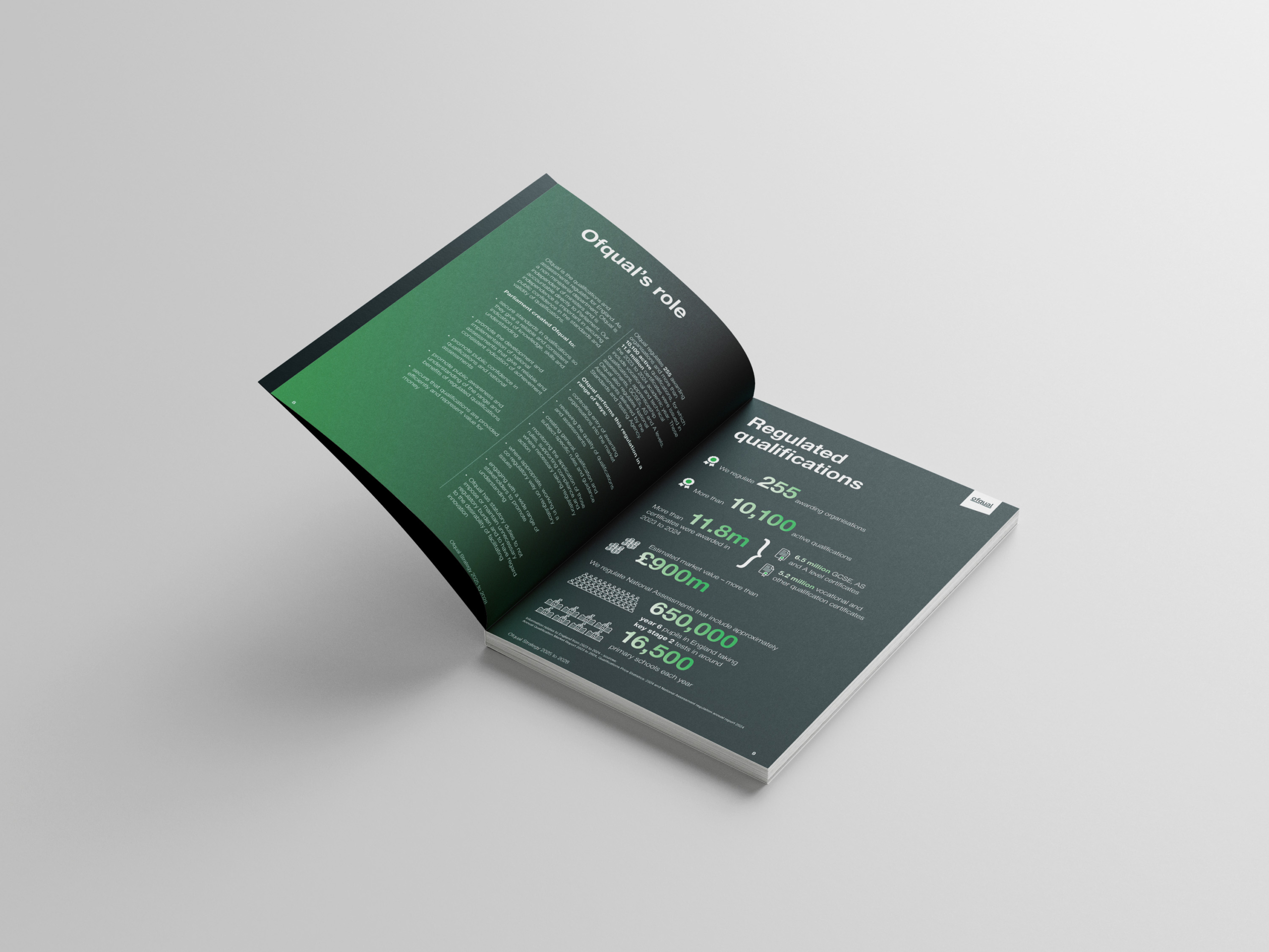
I started with the visual identity. The logo wasn’t changing but I changed how we used it, placing it in a container that became its own creative device and gave us a new shape to work with across the whole identity. I simplified and brightened the colour system, making it more vibrant and modern without losing the institutional trust the brand needed.
Campaigns existed before I arrived, but they weren’t really campaigns. They were things Ofqual was doing, with a few posts added afterwards. I flipped that. Start with the information, find the creative idea inside it, build something worth engaging with, and then layer the expertise and craft on top. Reactive became intentional.
I pushed a video-first content strategy, designing explainers that could sit alongside the edutainment content teachers were already watching. I also kitted out the organisation with the equipment to actually make it happen, and did a lot of it myself.
I built and shaped Can I Just Qualify That?, Ofqual’s first podcast. I drove the format, the content direction, the technical production and made sure it sounded like something worth listening to, not another corporate talking-heads show.
I also reshaped the team around the new approach. I brought in an additional creative and restructured the social media role that reports into me to fit the direction we were heading.
What changed?
YouTube up 419%. LinkedIn following up 23%, impressions up nearly 10x. The podcast hit 9,900 views and 162 hours watched, with coverage in The Guardian, The Register and LBC. And Ofqual now has an in-house creative function where there wasn’t one before.
But the number I don’t have a metric for is probably the most significant. When I joined, the appetite for anything outside the safe and expected was pretty limited. Stakeholders were cautious, risk-averse, and unconvinced that a different creative approach was worth it. Getting them to a place where they’re open to new ideas and backing work they wouldn’t have touched two years ago has taken as much effort as anything else on this page.
That work isn’t finished. But it’s moving.